Catch Me If You Can, Auto Focus, Far From Heaven and the Art of Retro Title Sequences by Deborah Allison Source: sensesofcinema.com Deborah Allison is based in the UK and has recently completed a PhD at the University of East Anglia: “Promises in the Dark: Opening Title Sequences in American Feature Films of the Sound […]
Read more
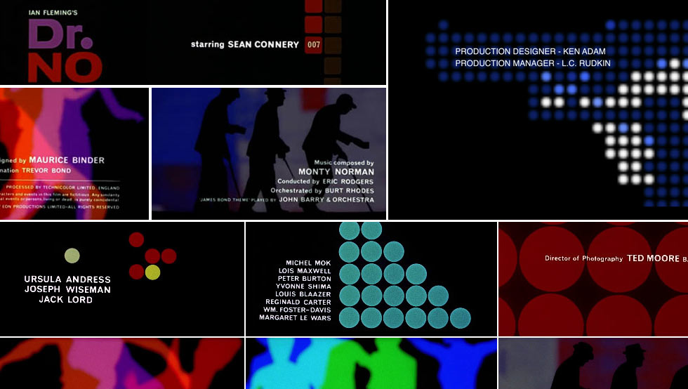
Many of the iconic aspects of a typical James Bond film were established in Dr. No, beginning with what is known as the gun barrel sequence, an introduction to the character through the view of a gun barrel, and a highly stylized main title sequence, both created by Maurice Binder. Maurice Binder was succeeded by […]
Read more
Studio: Digital Kitchen Creative Directors: Paul Schneider, Jeff Long Designers: Sevrin Handerson, Ken Kornacki, Mike Jacob, Jason Tang 3D: Mat Daly Editor: Eric Anderson Producer: Mark Bashore
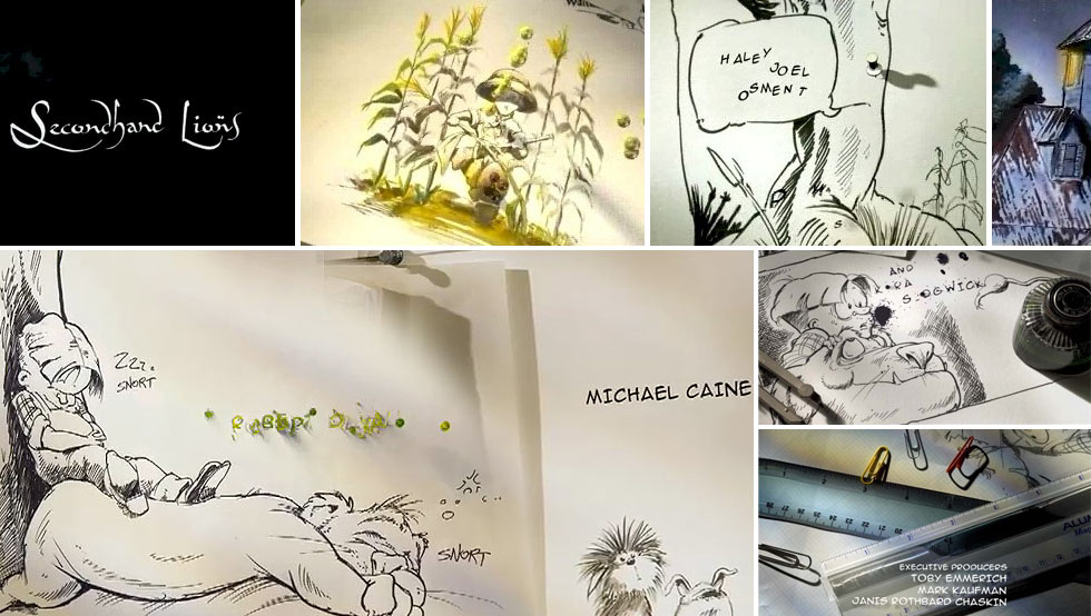
Read moreBy EMILY OBERMAN AND BONNIE SIEGLER Published: February 21, 2009 New York Times There’s an Oscar for pretty much every aspect of filmmaking, except one: the title sequences. Titles, though, have always played a significant part in motion pictures. They may have started out as simple black-and-white cards. But in the days before sound, they […]
Read more
Studio: Digital Kitchen Creative Director: Erin Sarofsky Designer: Erin Sarofsky Animators: Anthony Vitagliano, Shangyu Yin, Rick Thompson, Seth Ricart 3D: Mat Daly, Kenji Yamashita Editor: Matt Egan Producer: Colin Davis
Read moreTrue Blood Main Title Sequence Client: HBO URL: http://www.d-kitchen.com/project.php?p=128 DK Credits: Creative Directors: Matt Mulder, Rama Allen Live Action Direction: Rama Allen, Morgan Henry, Matthew Mulder, Matt Clark, Tevor Fife Designers: Rama Allen, Shawn Fedorchuck, Ryan Gagnier, Matthew Mulder, Camm Rowland, Ryan Rothermel, Jacques Broquard Compositor: Ryan Gagnier Editor: Shawn Fedorchuck Producers: Morgan Henry, Kipp […]
Read more