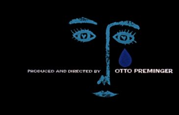
By Joseph Tabbi Was Saul Bass a writer? Was he a poet? Given that his film title ‘texts’ are not ‘his’ – not his compositions in the accepted sense, what is his art and how can it be seen as a writer’s art, a literal art? N. Katherine Hayles, an important theorist of writing in new […]
Read moreby Noell Wolfgram Evans A night at the movies once went like this: you’d arrive at the theatre, see a short subject, a cartoon, a smaller (B) movie and then the main feature would dance across the screen followed by a slate of coming attractions. Over time and for a variety of reasons this bill […]
Read more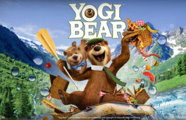
Creative Credits: Project: Yogi Bear main-on-end titles Client: Warner Bros. Design/Animation: yU+Co., Hollywood, CA Creative Director: Garson Yu Art Director: Synderela Peng VFX Director/Supervisor: Richard Taylor Producer: Sarah Coatts Effects Coordinator: Sean Hoessli Design Team: Edwin Baker, John Kim, Daryn Wakasa, Etsuko Uji 3D Stereoscopic Compositors: Stevan del George, Mark Velacruz After Effects: Jill Dadducci, […]
Read more


Recent Comments