Richard Morrison has created the film titles for Tim Burton’s “Dark Shadows.” It’s the third collaboration between Burton and Morrison, following on from the pair’s work together on the opening sequences for “Batman” and “Sweeney Todd.” The sequence was produced by th1ng, which exclusively represents Morrison for film titles design, world-wide. Morrison and th1ng […]
Read moreVia eyemagazine.com Title sequences of the 1950s and ’60s grabbed moviegoers with psychological insights, orchestral violence and some lessons learnt from the early pioneers of animation, for whom motion graphics, sound and story were inseparable. By Joel Karamath Title sequences have reached an unprecedented level of attention, with vast numbers of design studios dedicated to […]
Read moreby Noell Wolfgram Evans A night at the movies once went like this: you’d arrive at the theatre, see a short subject, a cartoon, a smaller (B) movie and then the main feature would dance across the screen followed by a slate of coming attractions. Over time and for a variety of reasons this bill […]
Read more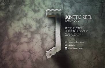
A swift look at the very best of Jared Flynn’s motion design reel, including work for Science Channel, History, National Geographic, Bonfire Films and a couple of his personal works as well.
Read more“Motion Plus Design” is a non-profit project which aims to create the first exhibition center dedicated to Motion Design in Paris, France. Students, professionals and anyone interested can discover artists, meet them and learn a thing or two. This centre will also provide an opportunity to promote artists in other design departments so the different […]
Read moreFind the common element among these things: Psycho; United Airlines; Quaker Oats; Dixie Cups; Goodfellas; the Girls Scouts of America. I picked a grab bag, and I could have included a lot more, to show how diverse the work of Saul Bass was; he did graphics, and more, for all of them. There is no […]
Read more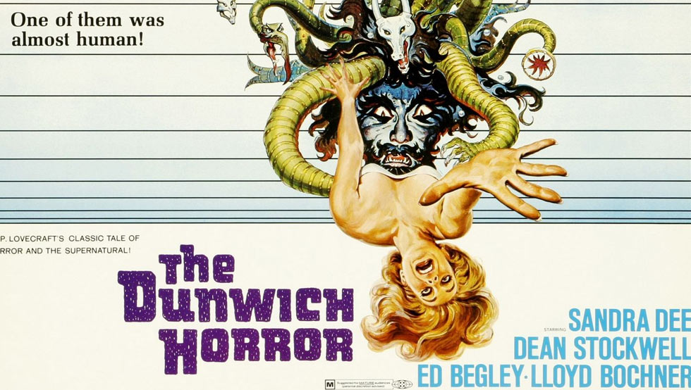
The Dunwich Horror is a 1970 B-movie from American International Pictures directed by Daniel Haller and produced by Roger Corman. The film was based on the short story of the same name by H.P. Lovecraft with a script co-written by future Academy Award winning director Curtis Hanson. Sandy Dvore is an American artist and graphic […]
Read moreNew York, New York, March 24, 2011 – Creative Studio Trollbäck + Company launched its digital division early March to expand its experience design capabilities and provide integrated digital solutions and interactive media for advertising / branding campaigns and public space installations. Making the decision to expand into digital was strategic yet organic, considering […]
Read moreSome of the most exciting creative work is being done in the field of title design for film, television, online and live gatherings. With its INTRO competition, The Type Director’s Club (TDC) recognizes excellence in title design and gives international artists a forum to showcase their work. The deadline for submissions has been extended to […]
Read more