What makes a good title sequence? How do you set the tone for a television series or film in 90 seconds? What do Hollywood directors want to see in a presentation? Danny Yount walks through the stories behind many of the most recognizable film title sequences in the last decade, including Kiss Kiss Bang Bang, […]
Read more
via http://www.theatlantic.com Pablo Ferro’s spindly lettering graced classics like Dr. Strangelove. Now, a documentary spotlights his contributions and colorful life. Anyone obsessed with film title design will recognize the name Pablo Ferro. The artist disrupted conventions starting with Stanley Kubrick’s Dr. Strangelove, where Ferro famously dwarfed all the leading cast and production names by making […]
Read more
The Opening Titles for Style Frames NYC. A Tendril Design + Animation Production directed by Anthony Scott Burns and Chris Bahry, and scored by John Black of CypherAudio. There is a great post on the making-of and process here:motionographer.com/2013/02/07/in-depth-coverage-stylefames-ny-opener/ Credits: Production Company: Tendril Design + Animation Directed by: Anthony Scott Burns and Chris Bahry Music […]
Read more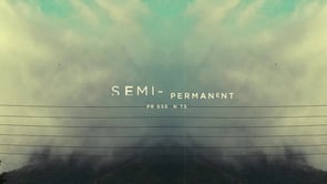
Opening titles for the 2013 Semi-Permanent design conferences. Shot on a 5D MKII and built in AE with no fancy plug-ins. Cheers to Simon, Murray & Andrew! semipermanent.com/ Music by Planet Love Sound / Produced at 1976 Studios planetlovesound.com/ 1976studios.com/ Made by Danny Yount dannyyount.com/
Read more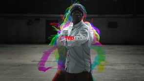
Agency : We Are Pi Director, Editor, VFX : Sophie Gateau Line producer / 1st Assistant Director : Lucas Posson Director of Photography : Alexandre Jamin Dancers : Maxime Bernard, Coralie Chaperon, Fleur Copin, Christian Kulenga, Hélène Renoux, Julien Verderi Colorist : Robin Risser @ Sabotage, Paris Music Composer : Kaiser Sound Studios
Read more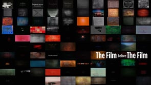
If you’ve ever seen a movie, you’ve seen opening titles of some kind. Opening credits have existed pretty much since the beginning of moving pictures, and they are as varied as the films themselves. “THE FILM before THE FILM” is a short documentary that traces the evolution of title design through the history of film. […]
Read more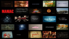
Four minutes montages of Laurent Brett’s best work with main titles for movies such as OSS 117, The Artist, Hostages and more. Laurent Brett started to work in 1993 in the video and commercial business at Bandits production as a post supervisor. After 4 years spent in the dark rooms of post companies, he started […]
Read moreI admit it. I binge-watched the Netflix series “Orange is the New Black” last week. Aside from the compelling character development, the spot-on production design and value and suck-me-in-and-never-let-me-go storylines, the opening title sequence is its own little masterpiece. It features closeups of faces of actual female prisoners — complete with tattoos, piercings and bad […]
Read moreWhen you create a film as powerful and revealing as “ESCAPE FIRE: The Fight to Rescue American Healthcare”(Roadside Pictures/Lionsgate), the new documentary that takes an unflinching look at the problems with the American healthcare system, you need a marketing campaign that is equally compelling. That’s why Directors Matthew Heineman and Susan Froemke, and Executive Producer […]
Read moreRichard Morrison has created the film titles for Tim Burton’s “Dark Shadows.” It’s the third collaboration between Burton and Morrison, following on from the pair’s work together on the opening sequences for “Batman” and “Sweeney Todd.” The sequence was produced by th1ng, which exclusively represents Morrison for film titles design, world-wide. Morrison and th1ng […]
Read more